


A Day Late--a note on Frank Stella

This is the Stella chapter from my book, The Fate of a Gesture: Jackson Pollock and Postwar American Art.
In 1956, when he was still a student in Princeton’s graduate painting department, Frank Stella had never seen the work of Jasper Johns. In some way, though, he knew of it. Johns’s art “was a kind of palpable reality of some sort that was in the air,” he later said. The young painter found it “interesting to hear about something strongly reputed to be good, and then actually see it be good.” From Johns, Stella took cues to a career so successful that, in the 1960s, he eclipsed everyone but Andy Warhol.
After a long look at Johns’s first exhibition, Stella filled several square canvases with horizontal stripes. Somewhere, usually near the center of the pattern, he would place a block of solid color. Though they contained no stars, these pictures had a conspicuous resemblance to the Flag. Stella’s instructor at Princeton was Stephen Greene, an Abstract Expressionist with no sympathy for Johns. On one of his student’s new works he scrawled “God Bless America.” Outraged at first, Stella forgave this flip assault as a sign of the desperation felt in a rearguard position. From Greene and the writers of Artnews, Stella had heard too much Abstract Expressionist talk of the painter who risks all in the struggle to stay alive to his experience. Already a self-confident skeptic, he wanted “to find a way that wasn’t so wrapped up in the hullabaloo.” Johns showed him the way with the stripes of his Flags, the calm of his monochrome, the restraint of his brush.
In the spring of 1958, Stella left Princeton with his Bachelor of Arts degree, and set up a studio in a store front on the Lower East Side of Manhattan. Three or four days a week he painted apartment interiors for a contractor who specialized in rush jobs for landlords under court order to refurbish their properties. His expenses met, Stella spent his days off covering canvases with stripes of black enamel. This was paint sold in gallon cans, not five-ounce tubes. His early paintings have the bleak, sooty look of commercial neighborhoods on the peripheries of Manhattan.
Tomlinson Court Park, 1959, is a horizontal canvas just over nine feet wide. Its outermost stripe makes an unbroken circuit of the edge, like a thin black frame. The next stripe makes the same circuit, just inside the first; the rest do same, stripe within stripe, until the canvas is occupied. An insistent eye could see this pattern as a bird’s eye view of a stepped pyramid. Yet the pyramid keeps collapsing. The image is as flat as the surface it covers, and if the eye balks at this obvious fact, the stripes overcome its reluctance with their unswerving reiterations.
In April 1959 a group show at Tibor de Nagy included a black-stripe painting called Club Onyx, 1959. Making the gallery rounds, Dorothy Miller looked in and was astonished by this young painter’s resistance to the authority of Willem de Kooning. Quickly, she arranged for a visit to Stella’s studio with Leo Castelli, who had just added him to his roster. Feeling her first reaction confirmed--and reconfirmed--by the insistence of Stella’s patterns, Miller declared her intention of including him in a group show at the Museum of Modern Art. Castelli suggested that the painter, then twenty-three years old, might be hurt by this early exposure. Turning insistent herself, Miller refused to consider the possibility. When her Sixteen Americans opened, in December, it included four of the black paintings.
Years later, Stella speculated at length about form in art. In 1959 he left the commentator’s job to Carl Andre, who wrote in the catalog of Sixteen Americans that “symbols are counters passed among people. Frank Stella’s painting is not symbolic. His stripes are the paths of brush on canvas. These paths lead only into painting.” True, said the Greenbergian Michael Fried, but what sort of paintings does Stella give us? Surely his canvases are not satisfied to be objects, mere physical things immersed in ordinary space. A painter of Stella’s high ambition must want to do more with paint and canvas than “reveal the properties of the material,” as Andre put it. Two decades later, Fried said that he had spent the mid-sixties struggling with Andre for the “soul” of Frank Stella.
Greenberg wasn’t convinced that the struggle was worth the prize. He and most of his followers dismissed Stella as one of the Minimalist enemy, a literalist like Donald Judd, who saw Stella’s striped canvases as objects—"slabs” to be hung on walls in place of paintings. As if happy to be taken for a literalist, Stella had said that, in his art, “what you see is what you see.” The question, Fried argued, is how an artist’s works compel us to see them. The viewer has no choice but to see a Minimalist’s box-shaped object as an object shaped like a box. But, he said, the shape of a Stella canvas doesn’t work that way. Because it reflects the internal pattern of the image, that shape is pictorial; it is visual, not just the literal edge of an object. No, the Minimalists replied. Stella’s stripes map palpable realities. He is one of us.
Fried would not give up. From 1963 to 1967, he published nearly two dozen reviews, articles, and catalog essays arguing at length or in passing that Stella’s images, no less than Olitski’s, generate a kind of “space accessible to eyesight alone.” Thus Stella’s ancestor is the good, “optical” Pollock of the Greenbergians, not the bad, literalizing Pollock of the Minimalists. As Fried and the Minimalists struggled for his soul, Stella favored neither side. He was absorbed in the effort, more successful every season, to heighten the inexplicable clarity of his art.
In a letter of recommendation written to the Fullbright Grant committee in 1960, Alfred Barr spoke of being “deeply impressed” by Stella’s black paintings. “I found my eye, as it were, spellbound, held by a mystery,” he wrote. “To me the paintings express a stubborn, disciplined, even heroic rejection of worldly values.” Having seen something unnamable--something transcendent--in the very simplicity of Stella’s patterns, Barr proposed to the trustees of the Modern that they acquire a black painting called The Marriage of Reason and Squalor, 1959. The trustees resisted. Castelli had given the painting a price of twelve hundred dollars. If it were five-hundred dollars less, Barr told him, The Marriage of Reason and Squalor could enter the Modern’s collection without the trustees’ approval. Castelli asked the director where he would get the money to make the purchase. From his own pocket, said Barr. Castelli lowered the price to seven-hundred dollars, and the painting was acquired.
Early in 1960, Stella switched from black to aluminum enamel. In the black paintings, stripes multiply in patterns that fit neatly onto the four-cornered surface of the canvas. The aluminum stripes are not so accommodating. Each has a “jog,” a right-angled break in its ruler-straight form. As they spread, these stripes left small patches of canvas uncovered. Stella cut them away. Adjusting canvas to stripes instead of stripes to canvas, he had made his first shaped paintings. A show of these works opened at Castelli’s in September 1960, just two and a half years after Johns’s debut.
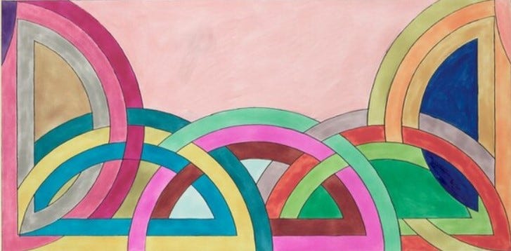
In Stella’s next series—the copper paintings—entire regions of the surface vanished, leaving a series of right-angled L, T, and U-shapes. Sometimes they stand alone, sometimes they multiply. Four L’s form a Greek cross; a pair of U’s back-to-back turn into a bulky H. Stella began with stark deprivations and carried on by relieving them, one after another. Monochrome gave way to polychrome, canvases developed extravagantly irregular outlines. Then, suddenly, Stella set aside his ruler and took up a protractor. Once-straight lines curved. Begun in the 1967, the Protractor paintings appeared the following year in Washington, D.C., Bennington, Vermont, Los Angeles, Toronto, and London. Turning out canvases at a prodigious rate, Stella fell behind the demand. Not until 1969 did Castelli have a chance to show a set of the new paintings.
After a decade of acceleration, Stella’s rate of innovation now turned manic. With paper, felt and painted canvas pasted to stretched canvas, he recapitulated the geometries of the visionary modernists--Antoine Pevsner, Naum Gabo, the hard-edged Wassily Kandinsky. Stella exchanged canvas for wood; for paper and felt he substituted more building materials—Masonite and Homosote. His collages were turning into low-relief sculptures. By 1975 Stella was assembling his works from flat shapes made of another new material: honeycomb aluminum. Streaking, scumbling, and sometimes simply smearing these metal forms with steamy color, he recalled the brushy New York manner he had resisted with his black stripes of 1959. The forms themselves took a readymade extravagance from the French curves of the draftsman’s kit.
As Stella loaded more elements into his constructions, low relief expanded to high relief and lost all resemblance to collage. He was a sculptor now, expert in a variety of fabrication processes. Yet he continued to insist that he had never ceased to address the fundamental issues of pictorial art. In 1984 he launched a series featuring cones and pillars. Bearing stripes of graduated width, these forms make arch reference to academic exercises in perspective. They allude as well to the evolution of the column in Western architecture, and to Cezanne’s remarks on the importance of the cylinder, the sphere, and the cone. Also, Stella’s latter-day stripes recall those of his early years, when Fried was trying to rescue him from the orbit of Andre and Judd.
Cantilevered deep into space, the pillars and cones of Stella’s maturity offered nothing of interest to interest Fried, who once led the fight for purely “optical” painting. Nor could Judd or Andre, those guardians of clarity and rigor, feel much affinity for the baroque artist Stella had turned out to be. The struggle for his soul, long abandoned, had been pointless from the start. Stella did not enter the 1960s poised between the Minimalist sculptors and the color-field painters; he never would have joined either team. In the moment of forming his first vague notion of ambitious painting, Stella became an “isolato” as independent as Johns or Pollock.
Though Stella’s striped patterns are locked to the surface of the canvas, they are only arbitrarily contained by its edges. One thinks of Pollock’s infinite, and the thought recurs whenever Stella clutters a work ingeniously enough to bewilder the eye. Like Pollock, Stella made allover images, but never with Pollock’s muscular urgency. At first, he restrained his arm. The black paintings are the work of an ascetic, inventive but unrelentingly strict. Later, he permitted himself to make sensuous art, but only on the condition that he work at a remove from his impulses. Since the early 1970s, Stella has been displacing the energies of hand and arm into the mastery of one advanced manufacturing technique after another.
Focusing as narrowly as he can on matters of form, he still insists that “what you see is what you see.” Stella’s aesthetic is militantly specialized, in principle. In practice, his idea of art is as boundless as Pollock’s idea of nature. And the extravagance of his inventions has for years been suggesting nature’s plenitude, as his forms and colors, combining and recombining, evolve and mutate according to rules that also come under evolutionary pressure, one season after the next. What you see is what you see, but what you sense is the force of inexhaustible vitality.
Truly great essay
In grad school Stephen Greene admonished me for work too akin to Stella . I took heart in Marcia Hahif’s essay Beginning Again and resisted simply turning brush strokes into ribbon candy ala David Reed. I never quite accepted Stella’s move into 3D space and big budget works. I thought and think that the challenges of painting are to be worked out in a 2 dimensional arena. A material echo of the retina.