


The Wit of Roy Lichtenstein

Last fall, a pair of Lichtenstein exhibitions went on view at two New York galleries. One show was stark, the other was lush, as if to remind us that here is an artist who made an esthetic principle of covering all the bases. “Roy Lichtenstein: Early Black and White Paintings,” at Gagosian, began at the beginning of the artist’s Pop career, in 1961, and continued to 1965. “Roy Lichtenstein Brushstrokes: Four Decades,” at Mitchell-Innes & Nash, started with several pre-Pop canvases from 1959 and ended with a trio of Oriental Landscape paintings from 1996, the year before the artist’s death.
With their militant austerity, the black-and-white paintings launched Pop Art’s first assault on the citadel of comfortable ideas about the messy, expressive nature of art. A few seasons earlier, Robert Rauschenberg and Jasper Johns had given the New York art world reason to think that the ascendancy of Willem de Kooning and his painterly colleagues would not last forever. Change was underway. Then Lichtenstein’s black-and-whites appeared and the art world understood that change would be cataclysmic.
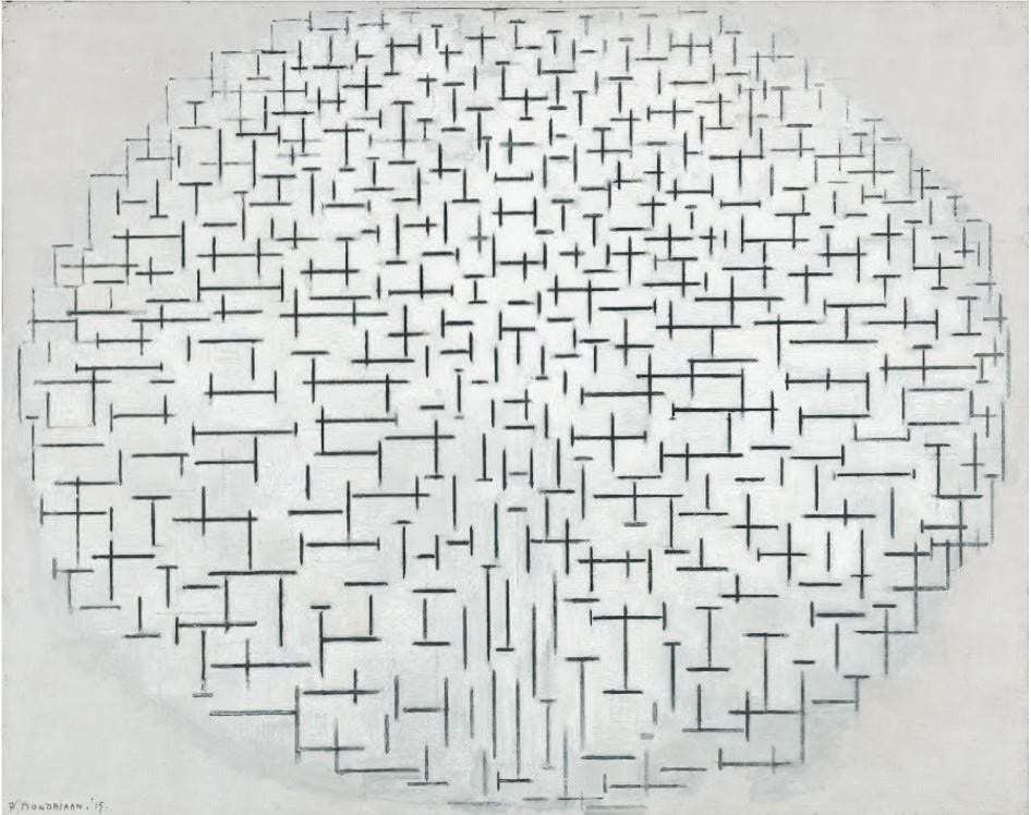
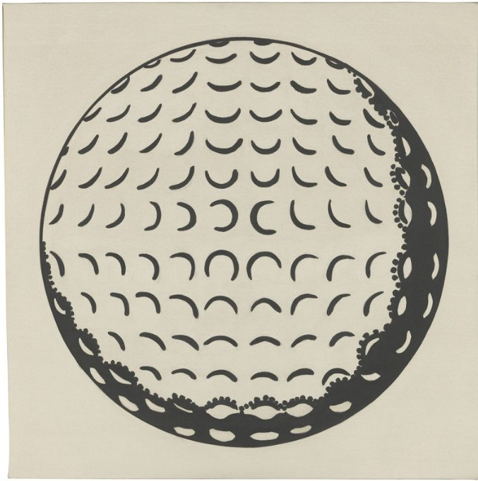
Golf Ball, 1962, has the sparkle of a freshly washed window. What you see is an image of a familiar object. What you get is a revision of Piet Mondrian’s “Pier and Ocean” tondos of 1914-17. Lichtenstein put pictures at the service of wit. Among the twenty-three works at Gagosian were two of the three Composition Book canvases. Like Golf Ball, Compositions III, 1965, centers a solitary image on the canvas. Here the image is the notebook’s label and the surrounding field crawls with an allover pattern that is two things at once: a replication of Lichtenstein’s dime-store source and an homage to the writhing tangles of Jackson Pollock’s dripped pigments. And it is a third thing: a reminder that many of Pop Art’s tactics evolved, by way of Jasper Johns, from Pollock’s challenge to harmoniously enclosed compositions as traditionally understood and still being produced in 1965 by such figures as Willem de Kooning and Robert Motherwell.
The Gagosian show was more than a nostalgic return to the years when Lichtenstein and the other Pop artists were tossing their stylistic bombshells into the increasingly complacent ranks of the postwar avant-garde. It was a reminder that even in his Pop period, Lichtenstein’s long view of history was inspiring revamps of Mondrian, Pollock, and other high-profile predecessors. The ascending scallops of the black-and-white Ice Cream Soda, 1963, may not allude to the stacked curves of Brancusi’s Endless Column, but, in an atmosphere glittering with allusions, it is likely that they do.
It is tempting to spot a reference and be content with the ensuing ah-ha reaction. But that response should be the beginning, not the end, of a look at a Lichtenstein picture. The wit of his reinventions touches every facet of his medium: not only subject matter but “pure form,” as it used to be called, not to mention style and scale and facture. The nuances of his allusions are endless and nearly always backward looking. Despite the freshness of Lichtenstein’s images—and the work of every period looks brand-new—the abiding subject of his art is the past, the hidden history of perception and memory. He wanted to picture what is difficult to imagine, much less see: the way an image relies, for its intelligibility, on a long series of earlier and mostly forgotten precedents. Though there is no harm in appreciating Lichtenstein’s wit for its own sake, his jokes become a lot more memorable when you see how elegantly they excavate an image’s previous lives.
Not all his allusions reach from the present into the past. Tire, 1962, one of the stunners at Gagosian, makes a sideways reference to the “unitary forms” the Minimalists were showing that year. This picture and Ball of Twine, 1963, join with “Minimalist” works by other Pop artists—one thinks of Claes Oldenberg’s Giant Pool Balls, 1967, and any number of monochrome panels in Andy Warhol’s paintings from the mid-60s—to suggest that Pop carried on a serious flirtation with abstract form. The other side of that coin is the figurative impulse that lurks unacknowledged in so much Minimalism. Tirelessly versatile, Lichtenstein referred to his own future, as well. The stark black-and-white Bathroom, 1961, was a prelude to the suite of mural-like Interiors he would launch by the end of the decade. And the gaudy Baroque of his Costume Jewelry series foreshadows the aggrandized odds and ends of Still Lifes to come.
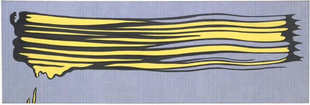
The Mitchell-Innes & Nash exhibition contained two of Lichtenstein’s early Brushstrokes: a study on paper, from 1965, and Yellow Brushstroke II, also 1965. Here Lichtenstein used his standard devices—solid black line, benday dots, flat patches of color—to picture the basic element of painterly painting. As the 1960s began, he and the other Pop artists had endowed the juicy, dripping streak of Abstract Expressionist pigment with a look of obsolescence, yet here it was again, welcomed into Lichtenstein’s repertory alongside his panels from comic books of love and war. This may have been the first clue that Lichtenstein would become one of those universalizing artists who—like Mondrian—wants to take everything into account.
Literally, of course, it cannot be done, just as a cartographer cannot make a life-sized map. Universalizing artists need to find ways to mean more than their finite bodies of work can possibly say. Mondrian believed that if he expunged all particulars from his art, all true generalities would make themselves manifest. Or, as he put it, by excluding the familiar “appearance of objects,” a strictly non-figurative style “expresses the universal—the core of all things, and thus actually represents things more completely.” (“The New Plastic in Painting, 1917). Rather than chase after essences, Lichtenstein pursued a narrative strategy.
After the irregularities of the Brushstrokes came the straight lines and compass-made curves of his Art Deco imagery. Then the quasi-abstraction of his Mirrors and Entablatures. As these series continued, he also made Still Lifes, one with allusions to Matissean goldfish, and the big Artist’s Studio canvases, one of which includes a fragment of Henri Matisse’s Dance, 1909. In 1974, Lichtenstein gave Theo van Doesburg’s cow a makeover, then moved on to Futurism and Surrealism. He was retelling art history in his own visual terms. Adding a color to his palette now and then and allowing his line to turn brushy, he continued this project for the rest of his career.
A survey of Diane Waldman’s comprehensive Roy Lichtenstein, 1993, shows that, as he ranged from Brushstrokes to Landscapes, from comic books to Art Deco to ancient sculpture, Lichtenstein gave his distinctive treatment to thirty-two separate themes and styles—though I don’t insist on this number. Sub-themes and digressions complicate the count. Should we include Temple of Apollo, 1964, and Three Pyramids, 1969, with the Landscapes of 1964-69? Or do they form their own series of two?
Ambiguities of this sort are so frequent they look deliberate: Lichtenstein’s way of ushering his art into a shifting and potentially infinite field of thematic possibilities. For his oeuvre is massive and varied enough to suggest that, no less than the visionary modernism of an earlier era, Lichtenstein’s art is limitless. For if, by implication, he made subject matter of art in its entirety, by further implication he touched on all of life that art has ever engaged. Wassily Kandinsky’s big subject, a variant on Mondrian’s “universal,” is the “one common root” from which all “individual phenomena” sprout. (“Synthetic Art,” 1927). Lichtenstein’s big subject—his counterpart to these otherworldly absolutes—is the human need to turn the world into images: visible evidence that we do not merely cope with our surroundings; we render them significant with interpretations that can’t help but give things a new look.
At first the brushstroke was a motif to be Lichtensteinized. Then it became one of his devices for transforming other motifs. By the early 1980s, he was using these familiar, hard-edged squiggles to reconstruct the forms of generic landscape and, of all things, de Kooning’s Women. By mid-decade he had begun to mix his Pop-style painterliness with streaks of pigment laid on with a brush. At the time, these “real” brushstrokes looked like something new for Lichtenstein. As the 1959 canvases show, they were something old: part of the baggage he left behind when he entered the ’60s as a Pop artist. You could argue that he returned to his beginnings with the “real” brushstrokes of his last two decades. Yet the sweep of the survey at Mitchell-Innes & Nash suggested that he was bringing his past forward, recycling it along with everything else he recycled over the years.
In 1959, Lichtenstein’s streaks of color already had the look of high artifice. Sometimes he would build smallish touches of paint into images of wide, ribbony brushstrokes. And sometimes he would go farther, scraping down his colors until he had expunged every trace of his painterly hand. Lichtenstein wanted his images to count as sheer images, claiming no credit for such virtues of the 1950s as sincerity or desperate passion. His passion was for the clarity that produces wit and sustains large purposes. “Real” or not, his brushstrokes do their proper tasks with precisely calibrated degrees of energy.
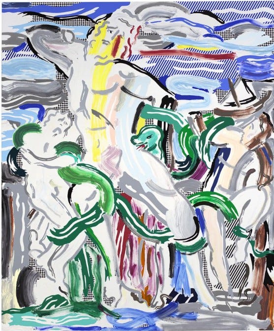
Certain subjects—the Laocoon, 1988, with its roiling Hellenistic melodrama, or a moody vista like Landscape Through the Trees, 1984—might have challenged for a moment Lichtenstein’s power to remake everything on his own clear-eyed terms. If so, he never faltered. His command of his art and his subjects held steady even in the Oriental Landscapes of 1996, where the painterly paint is extremely brushy—and, furthermore, representational. With these smears of gray, Lichtenstein pictured clouds. He also presented another episode in the long story of the Lichtensteinian brushstroke: every few years, this pictorial device feels restless and invents a new way to picture itself.
Joining forces, the Gagosian Gallery and Mitchell-Innes & Nash installed a large Lichtenstein sculpture, Brushstroke, 1996, in front of the Seagram Building, on Park Avenue. Here, the themes of the two galleries’ exhibitions converge, or they would if the sculpture were black and white instead of black and pale yellow. The convergence is close enough to suggest the unity of Lichtenstein’s oeuvre—and the way his subjects crowd into one another’s territories. Just over thirty-two feet high, this Brushstroke suggests a waterfall as it might look in one of the artist’s landscapes. Or, it occurred to me, the sculpture’s sinuous lines are the Seagram Building’s verticals undergoing a meltdown. Others will give other readings. For Lichtenstein always knew what to do with clarity: push it to the point where it becomes ambiguity and opens onto everything.
This essay feels so timely, even as it's an older essay about work that isn't current. I think there might be a lot to think about in regards to the digital transformation of our way of seeing and thinking.
interesting in retrospect. The works were and still are witty references to other masterworks past. Like an essay composed of quotations, viewers must be in on the jest. Honestly, they seem dreary in retrospect, like a stale joke.
More importantly, the artist propelled the "Trans-avant-guardia" Movement that affected Architecture, Painting, Sculpture, Interior Design, Ballet, etc. 30 some years later, it all looks like Victoriana . Gingerbread extravagances pasted together to entertain viewers taking the pleasures in there " in the know" winks and giggles.
References do not open out all of humanity to me. Rather, they remind me how great the originals are. Why not spend your time with the originals ? is the reasonable question.
Lichtenstein also led the way for the Shapeshifters-- Madonna, Gerhart Richter, etc ad infinitum, Celebs, etc.... my favorite is "Snoop Dogg" , who is a charming man with a likeable voice, doing G-Funk, R&B, Gospel, and working on Jazz. .....Will the real Dogg please stand up ??
But, what is this about. ? It is not about mystery or uncertainty principles, an elusive glimpse of ineffable psychic states --- Not At All.
It is plain commercial work, like party cakes made of sugary decor to please the party goers, who cannot remember why they were invited.
In retrospect, the Victoriana Period looks muddy, vain and cheap. It will appear as vital and poignant as the English Victorian does now.
At its best, it is witty, cute, and sly. At its worst, just sad.
The auction values of the Shapeshifters will follow the decline of those English Victorian Artists.